
To calculate result you have to disable your ad blocker first.
The topic that we are going to cover in this article is the bar chart, which is a very important part of data interpretation, and as all of us know data interpretation is very essential in statistics. Bar charts have several benefits which are used in many fields.
It provides a clear and concise way to present information, making them valuable data analysis, and communication tools. In this article, we’ll explore the concept of bar charts, types, properties, advantages and disadvantages, and tips for creating effective bar charts.
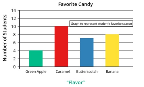
A bar graph represents numerical data by several bars(rectangles) of uniform width erected horizontally or vertically with equal spacing between them it is also known as a bar graph or column graph.
The bar charts have different types, each suitable for different data presentation needs. Let’s explore some common types.
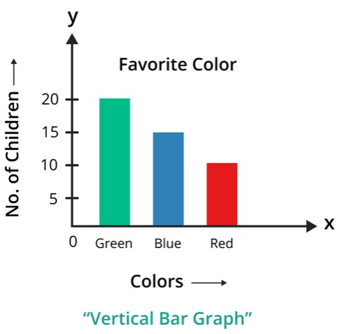
The vertical bar chart is one of the types of bar chart it is also known as a column chart. In this type, the bars are oriented vertically along the y-axis. In this, categories are placed on the x-axis, and numerical values on the y-axis.
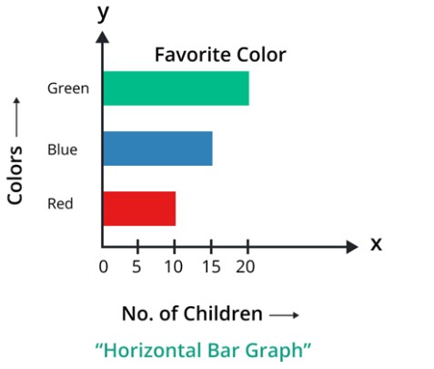
This type is the contrast of a vertical bar chart, in this type categories are placed on the y-axis, and the numerical values are placed on the x-axis. This type of chart is useful when labels or category names are lengthy.
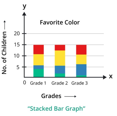
A stacked bar graph is like a simple bar graph. It represents the multiple variables and subcategories within a single category. In this type, the total height of each bar represents the cumulative value of all the variables being compared.
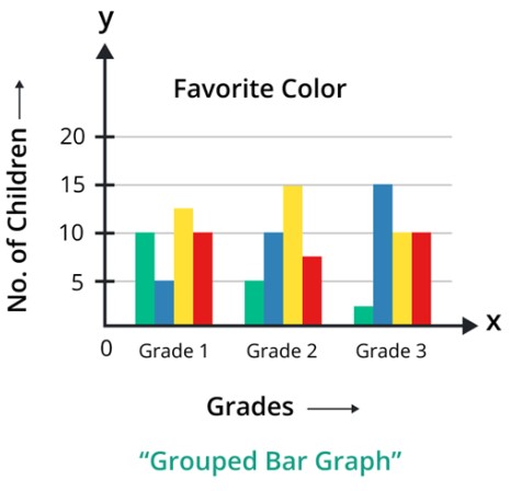
A bar chart that is used to compare multiple categories side by side, allowing for easy visual comparison between different groups is called grouped bar chart. Every category has a unique set of bars, and each group is closely gathered with others.
The steps to create a bar graph are as follows,
Step 1:
Determine the data: First, determine the data which we want to represent on the graph. For example, let’s say the manufacturing of cars in a manufacturing factory during 2008-2018 is given below.
Years | 2014 | 2015 | 2016 | 2017 | 2018 |
No. of cars manufactured | 150 | 250 | 200 | 325 | 225 |
Step 2:
Draw the axes: Now draw the x-axis and y-axis on the graph paper or blank sheet.
Step 3:
Label graph: Now label the years on the x-axis and the number of cars manufactured on the y-axis.
Step 4:
Choose the scale: Now we take the scale, for example, scale = 1cm = 50 cars repeat this step every year.
Step 5:
Draw the bars: Make sure the width of each bar must have an equal distance.
Step 6:
Give title: Label the graph with the title.
The bar charts have many properties but here we’ll discuss only some properties. These properties make this unique from other charts.
A histogram and bar chart both are used to graph the data. In the Histograms chart, the bars touch each other, and the histogram chart uses quantities. On the other way, a bar consists of that bars that don’t touch each other, and bar charts use categorical data.
Everything has some advantages and disadvantages here we’ll discuss some of the bar charts.
In this article, we read that a bar chart is a useful tool for the interpretation and visualization of given data. It offers various types which are suited for different data presentation needs, including horizontal, vertical, stacked, and grouped bar charts.
To calculate result you have to disable your ad blocker first.