
To calculate result you have to disable your ad blocker first.
Graphs are the most important and significant ways that are broadly employed in several fields to describe and anatomize associations of different quantities or expressions on a coordinate plane. It explains the relationships between various quantities in a precise and concise way.
Employing graphs, we not only represent quantitative data, but qualitative data can also be represented. It is a convenient way to visualize complex sort of information or data. In this article, we will explore the important concept of graphs along with its types and examples.
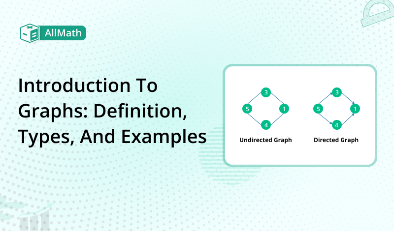
A graph is a pictorial way of conveying data or information. It elaborates on a mathematical illustration of a network and explains the connection or relationship between points and lines. The graphs consist of points and lines.
Graphs are used for the imitation of real-world problems like transportation systems, social networks, computer networks, etc. making it convenient to apprehend and analyze complicated information.
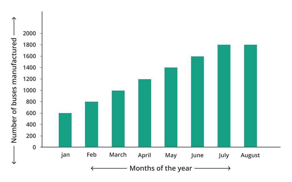
Bar charts are widely used to compare categorical data. They consist of vertical or horizontal bars representing different categories and their corresponding values. Bar graphs are effective in displaying discrete data and making comparisons between different groups or variables.
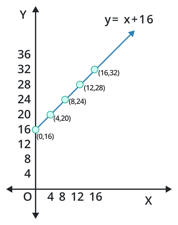
Line graphs are ideal for showing the relationship between two variables over a continuous interval. They use lines to connect data points, illustrating how the values change over time or other continuous factors. Line graphs are commonly used to depict trends, fluctuations, or correlations.
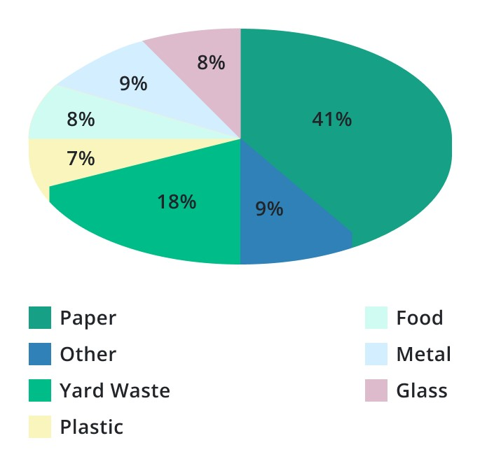
Pie charts are circular graphs with portions that show different categories or percentages of a total. They are useful for showing the percentages or relative proportions of various components within a whole. Pie charts can be used to show composition analyses, market shares, or survey data.
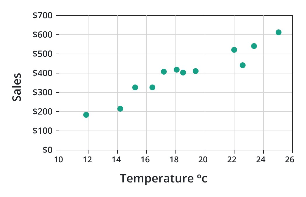
Scatter Plots indicate the relationship between two variables. Scatter plots play a crucial role in the study of statistical analysis and terms. It denotes each data set on the graph by locating a point along the x-axis and y-axis depending upon the nature of the relationship between the variables.
Usually, it explores famous statistical terms like correlation, outliers, or clusters in the given data set.
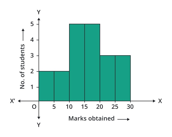
Histograms consist of bars that represent the frequency or count of data falling into predefined intervals or bins. It provides insights into the shape, spread, and central tendencies of the data.
Area graphs are similar to line graphs but filled with colors or patterns to represent the cumulative values of different variables over time. They are effective in illustrating the composition of multiple variables and their changes over time.
Network graphs signify the relationships between different entities or nodes. They consist of nodes connected by edges, depicting connections, dependencies, or interactions. Network graphs are very utilized in computer science, transportation planning, and social network research.
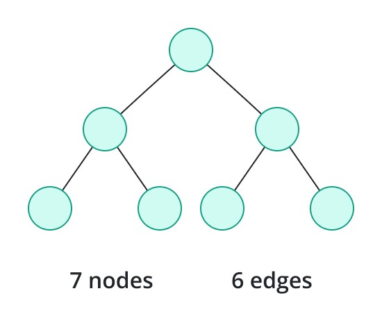
Tree graphs, also called hierarchical diagrams, display a hierarchical structure or relationships between different elements. They use nodes and branches to represent parent-child relationships, organizational structures, or classification systems.
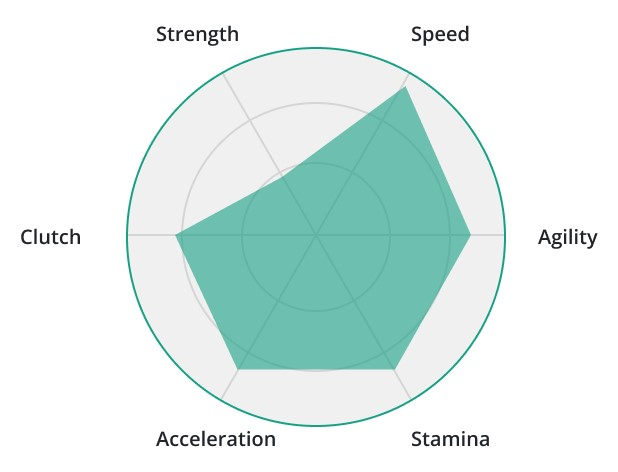
Radar charts, also known as spider charts or web charts, display multivariate data in a two-dimensional graphical form. Radar charts are effective in comparing the performance or characteristics of multiple entities.
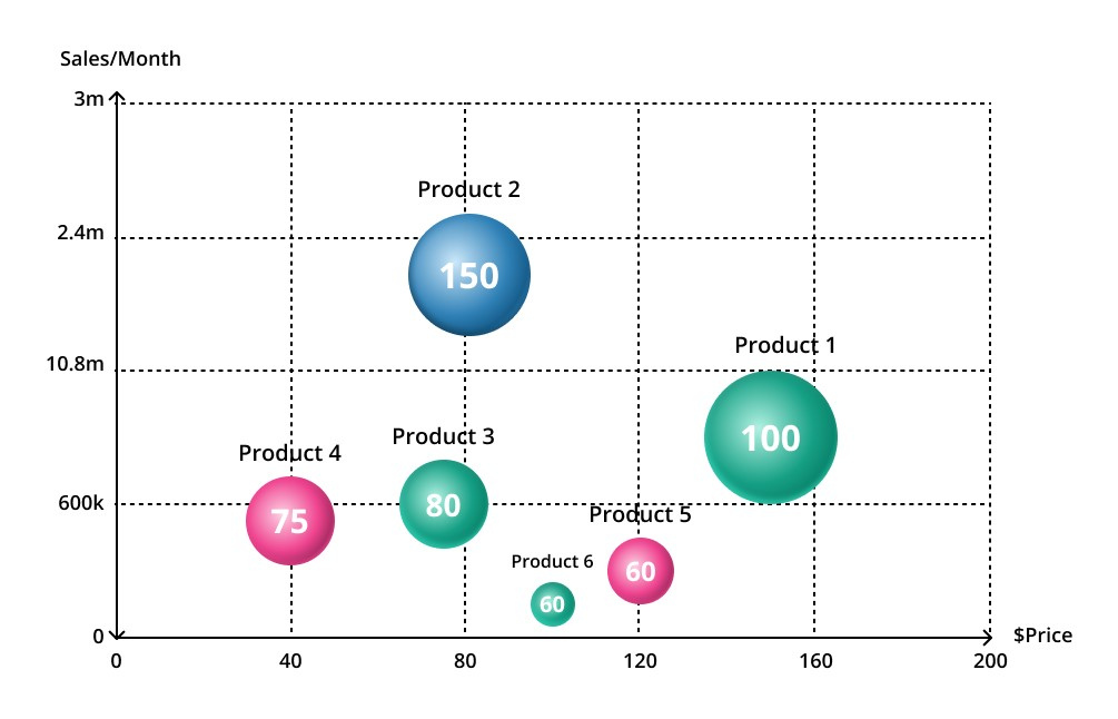
Bubble charts display three dimensions of data by using bubbles of different sizes and colors. They enable us to visualize the relationships between the variables simultaneously. The concept of bubble charts is employed in economics and finance.
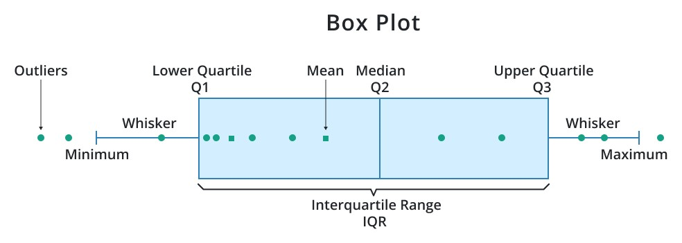
Box and whisker plots, also called box plots, provide a visual summary of a set of data. They display the minimum, maximum, quartiles, and outliers of a dataset, helping identify the distribution and variability of the data.
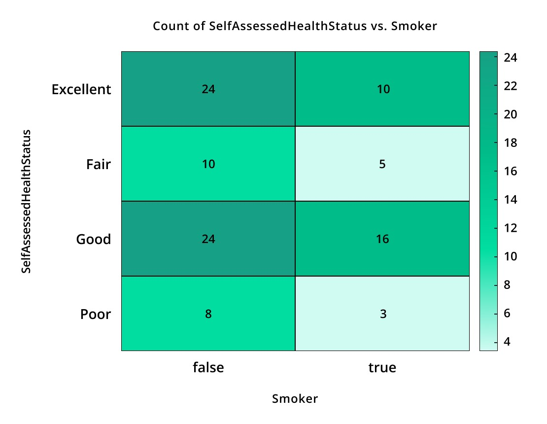
Heatmaps use colors to represent the magnitude of values within a matrix or table. They are useful for visualizing data density, correlations, or spatial patterns. Heatmaps find applications in genetics, data analysis, and geographical information systems.
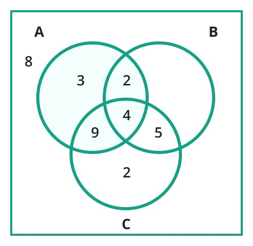
Venn diagrams use overlapping circles to illustrate the relationships between different sets or categories. They show the intersections and differences between sets, helping analyze logical relationships, overlaps, or similarities.
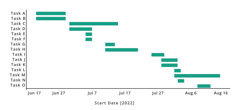
Gantt charts are popular in project management and scheduling. They visually represent tasks, their durations, and dependencies over a specific timeframe. Gantt charts help plan and monitor project progress efficiently.
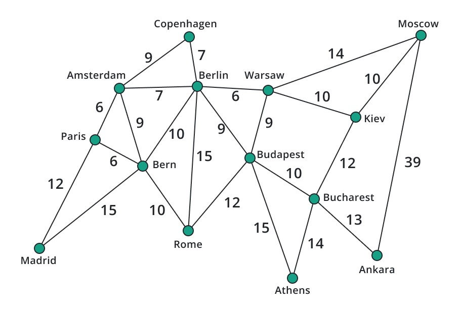
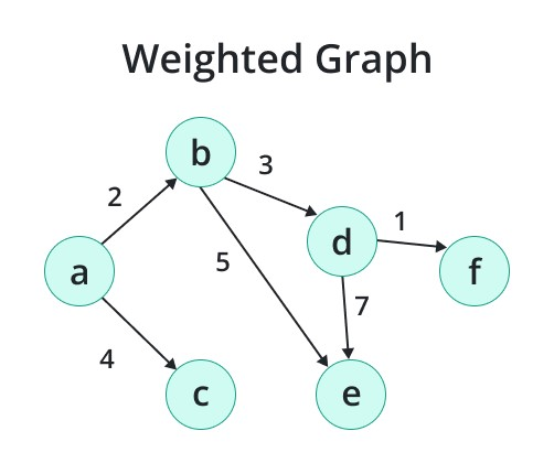
Weighted graphs assign a numerical weight or value to each edge. These weights can represent various properties, such as distances, costs, or probabilities associated with the connections between nodes.
Weighted graphs are employed in route planning, financial analysis, and data clustering applications.
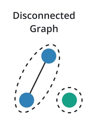
In contrast to connected graphs, disconnected graphs have one or more components where there is no path between certain pairs of vertices. The primary purpose of disconnected graph analysis is to determine isolated subnetworks or clusters inside of a larger system.
Here we will discuss the important principles to apprehend graphs in a better way.
Vertex is an important component of a graph. It is also known as a node. It represents an entity or an element in a graph. For example, a vertex can represent an individual user in a social network graph.
An edge analyses the link or connection between two vertices. It shows that there is a link or interaction between the entities that are represented by the vertices.
It represents the level of connectivity or influence of a node. It denotes the number of friends or relationships in a social network that the vertex of a user has.
Cycles can represent recurring patterns or self-referential relationships in a system.
Example 1:
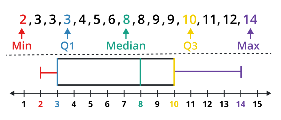
For the following data set (Hours spent on homework), display a Box-and-Whisker Graph.
9, 3, 10, 2, 6, 8, 3, 11, 14, 3, 4, 8, 9, 12, 5
Solution:
Step 1: Arrange the given data values.
2, 3, 3, 3, 4, 5, 6, 8, 8, 9, 9, 10, 11, 12, 14
Step 2: Determine the minimum value, maximum value, 1st & 3rd quartiles, and the median of the given data values.
Min value = 2, Max value = 14, Q1 = 3, Q2 = median = 8, Q3 = 10
Step 3: Representing a Box-and-Whisker plot.
Example 2:
Draw a graph for the quadratic function y = x2.
Solution:
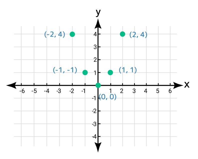
Step 1: Given information:
Quadratic function: y = x2
Step 2: Determine the y coordinates for the given values of x.
x | -2 | -1 | 0 | 1 | 2 |
y = f(x) | 4 | 1 | 0 | 1 | 4 |
(x, y) | (-2, 4) | (-1, 1) | (0, 0) | (1, 1) | (2, 4) |
Step 3: Locate these order pairs on the Cartesian coordinate system.
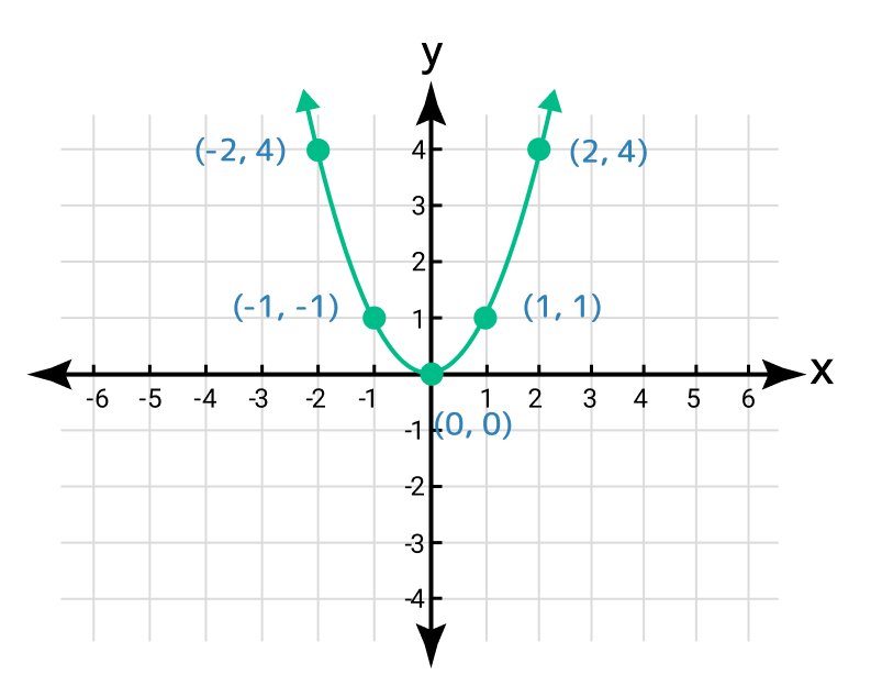
Step 4: It displays a parabola shape with its vertex at the origin by joining these points.
To calculate result you have to disable your ad blocker first.